I woke up this morning, with a yearning for a green-tea latte from Starbucks on my way to school. I remember seeing people rush to a store and grab a coffee already there waiting for them. So probably I could do an online order too to save some time.
I was about to head out with my backpack ready in hand, when I decided to do this. Googled “order Starbucks online”. Downloaded the app. Open the app. The layout is clean and pleasant. I saw an “order” button in the middle of the bottom menu bar. Tap on it and I saw all types of drinks. Somehow I thought green tea latte should be one kind of coffee (my bad). So I searched in “Hot Coffees” but surprisingly did not see it there. Never mind, because I saw that search option on top of my screen. Typed in “green tea latte”. There it was!
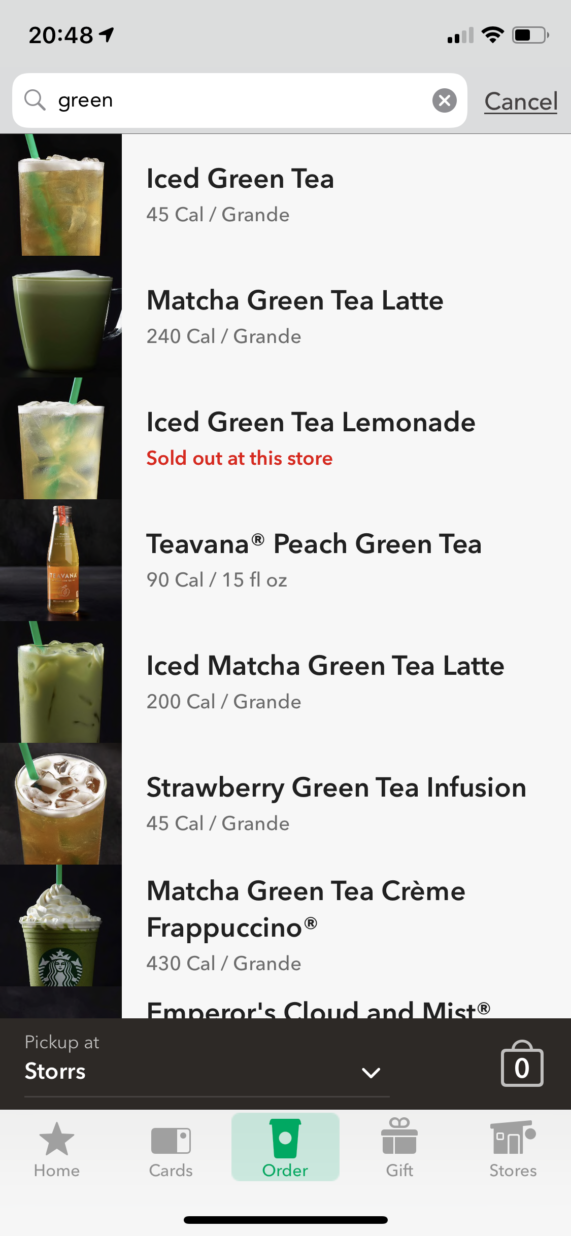
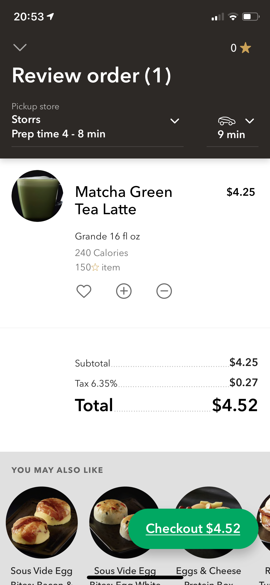
On the product page, There were a bunch of options you could customize besides the size– add-ins, flavors, toppings, milk type– and even number of scoops of Matcha powder. Not a big fan of Starbucks, I didn’t know of these options before and definitely wouldn’t have tell a cashier ordering at a store. I explored the options a little bit, added my credit card and finally clicked “checkout.” Everything went smooth until this point, when here came a message. The preparation time would be several minutes shorter than my travel time to the store. So Starbucks suggested me placing the order when I am closer to the store. OK. I don’t want to miss that first hot sip. So I returned and head out, thinking that I could easily press the button to order on my way.
Now only five minutes away from the store. I was driving in a long line of cars waiting for the traffic light. Should be a good time to place that order, I thought. When I clicked “checkout” again, it did not process through, but rather asked me to add an associated address for the credit card. Wait! Wouldn’t that be part of the “adding a card” process? Now I had to type in my name and address with the other hand steering. Oh no, the light turned green and cars were moving forward. A lot of typos! … Finally I gave up.
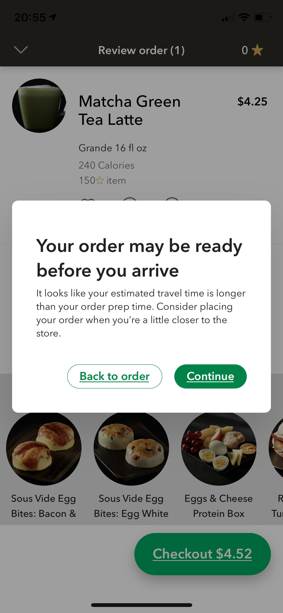
I don’t know what exactly is the reason for that pop-up reminder message, but it clearly confused me and led to my misunderstanding as a first-time user. Key take-aways:
- Make sure that the mental model/ schema matches. In this story, their mental model when making the app doesn’t match mine: I thought all steps about credit card are already included in the “adding a card” stage, not when I am about to place an order.
- Know the context of using the app. In this case, your user may be driving or on a hurry and may not have time to fully operate.
- No need to send noisy messages that could mislead users, like the pop-up reminder, if the potential error is not fatal. Usually you only see a reminder or warning message immediately prior to the final action (purchase, submission, etc.) to avoid human errors or slips.
Make sure your design is the cup of “coffee” of your users.
